Lab 1: Technical Applications of Microsoft Office-Graphing Using Excel
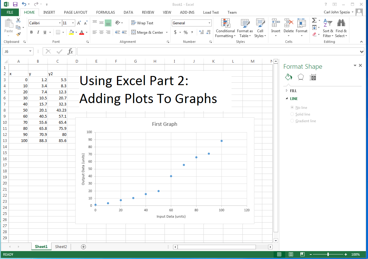
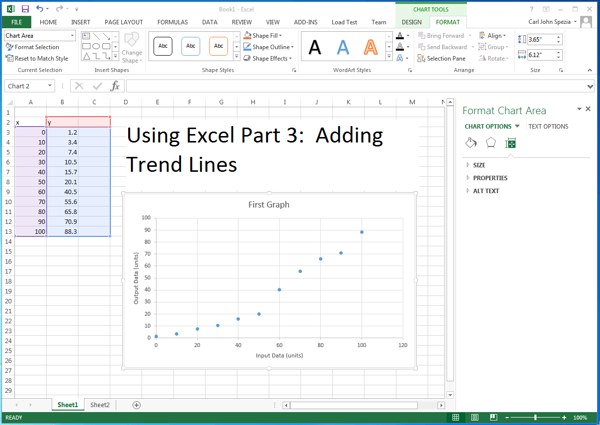
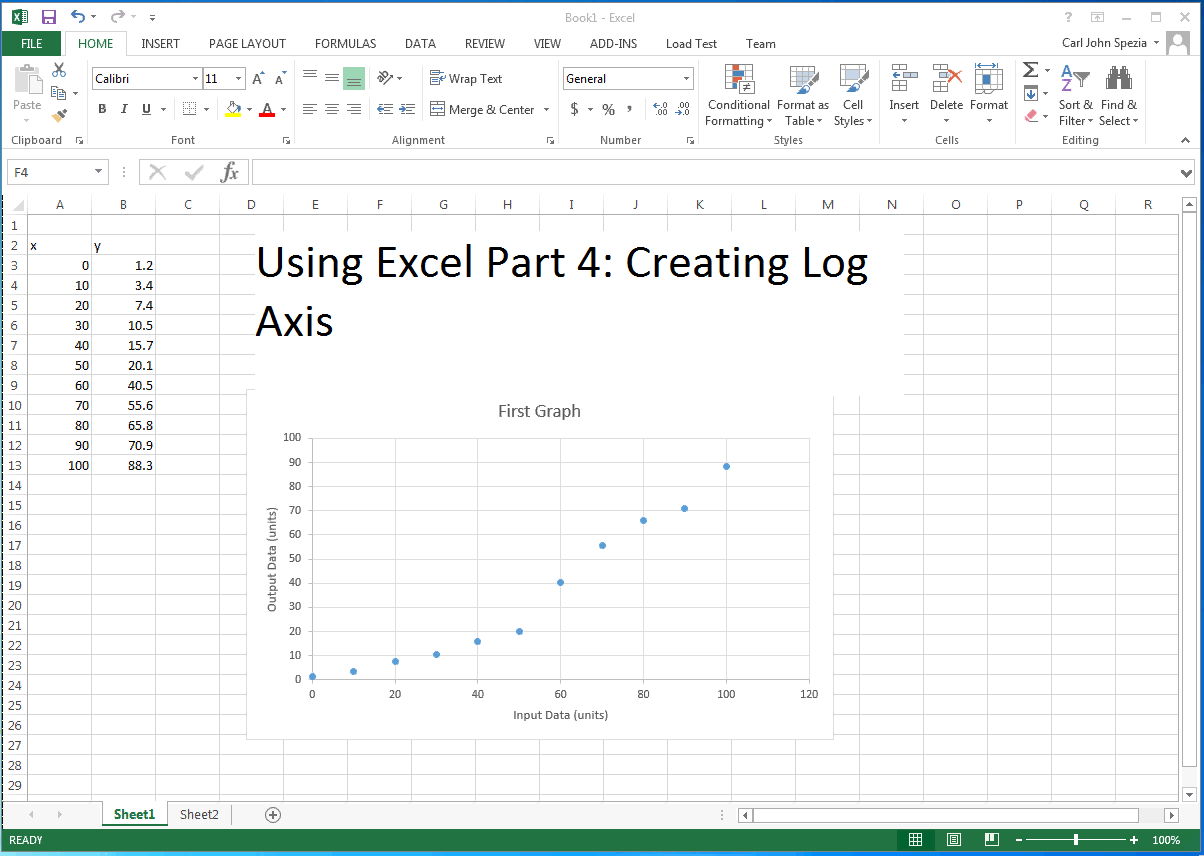
This collection of videos shows how to use Microsoft Excel to plot data and create graphs. This is an important part of technical write and reporting. Part 1 of this sereis shows how to enter data into spreadsheets and use the scatter plot from Excel to plot engineering data. This presentation also show some basic formating techniques. Part 2 covers the addition of additional plots to a single graph. Part 3 demonstrates how to add trendlines to data points plotted on the graphs. Trendlines provide mathematical relationships between the x and y data points. The last presentation, Part 5, shows how to create a logrithmic axis on a x-y plot. This is useful when there is a wide range of data points the cover serveral powers of 10.
Presentation Times:
- Part 1: 8:31
- Part 2: 3:42
- Part 3: 4:40
- Part 4: 4:09